Glints - Homepage Revamp

  • Company
    Glints
  • Year
    2019
  • Type
    Responsive Web
Background
Based on the previous user interview about why are user signed up but never applied, top reasons is they can't find job that suitable for them and secondary data tell us that our job supply is very low compared with other competitors.

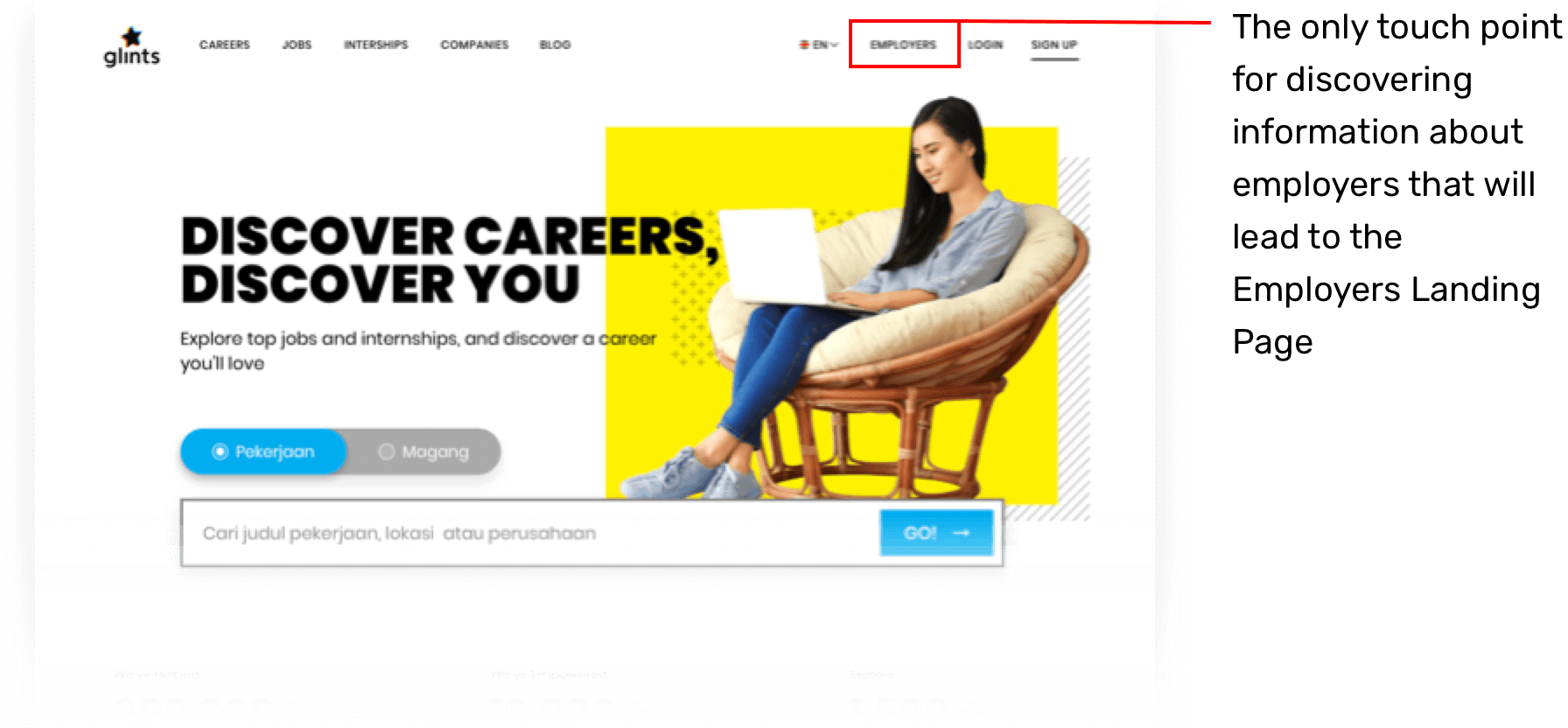
The sales team finds difficulties in informing clients (employers) about Glints service, especially if they discover Glints on Google, they'll visit the candidate site with minimum information about the employer's site. Therefore, the conversion to the employer's site is very low and affected to low signup and job post.

Problem Statement
How might we inform clearly about Employers on glints homepage to increase conversion to Employers page and lead to new organic company/job post.
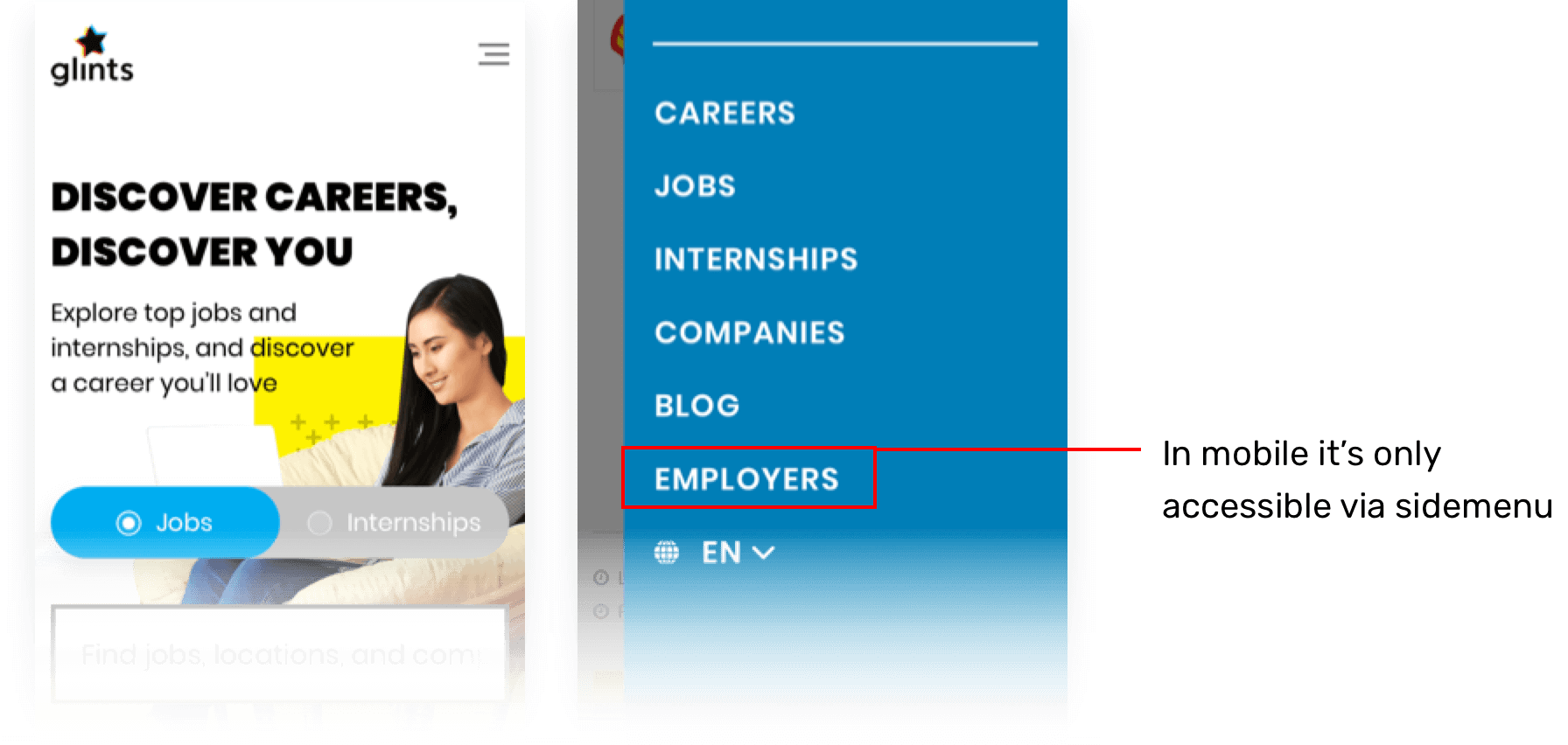
On the current state, the information that will lead visitor to the employer's page is very minimum.
Pre-research Assumption
We want to improve employer’s user journey (especially from Google), when user search Glints at Google they can easily find a section to learn about our service for employers (including other Glints premium services) and it will increase conversion to Employers page and lead to new organic company/job posts.
Goals
- Increase number of new job listing
- Increase number of new companies

- Increase number of inbound leads for Glints premium services/products
Ideation
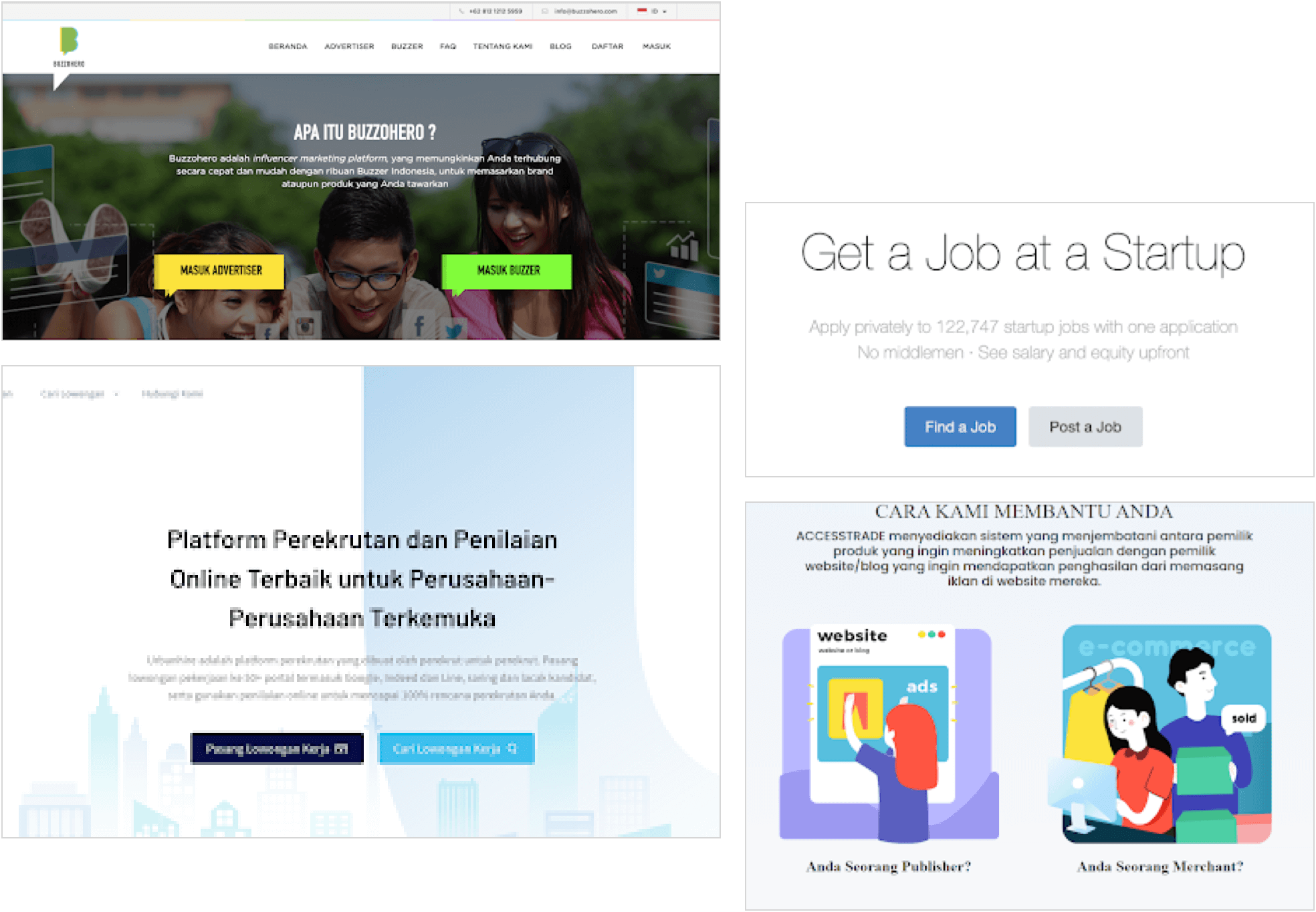
Lightning demos / competitor analysis
Proposed solution to be tested
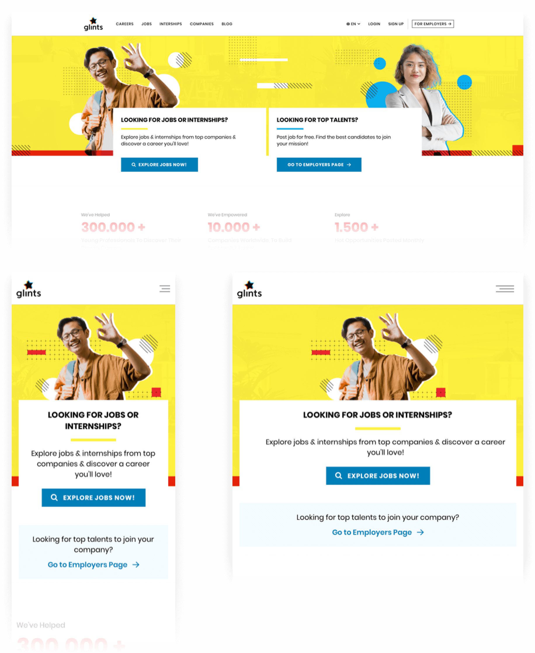
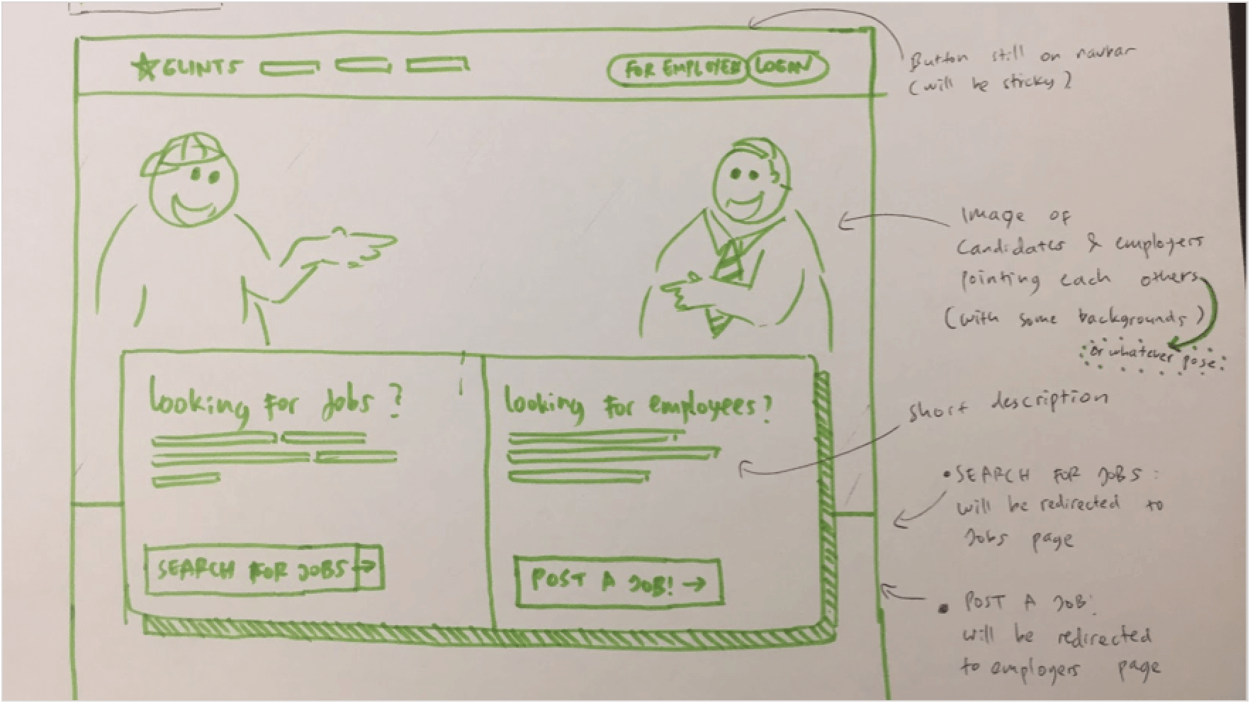
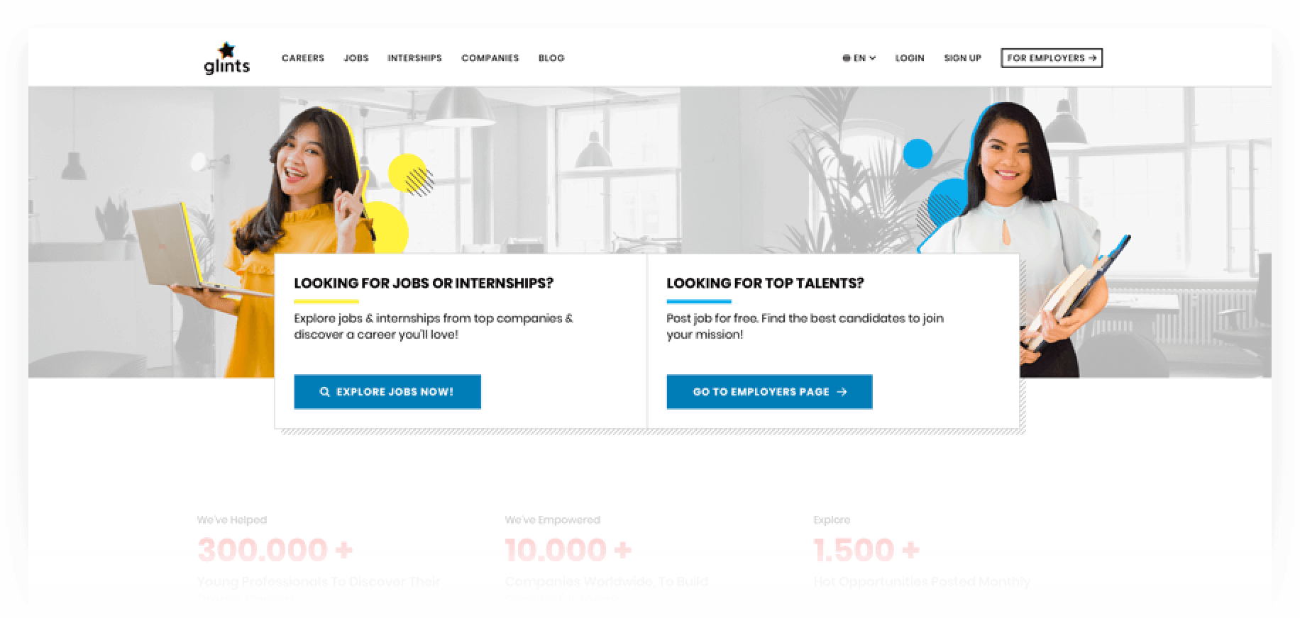
- Add a section on header/first fold as a new touchpoint to the Employers landing page, so the employers landed on homepage will get information about where they should go.

- Separate the CTAs for Candidates and Employers. Focusing the homepage as a one stop solution for career development place. So the job searching will be focused on Jobs listing page.

- Increase the visibility of the Employers menu on navbar so when user scroll down it will still be visible
Testing method
Moderated usability testing with 5 participants currently working as HR/Hiring/Talent Acquisition in BDSM (Business development/Sales/Marketing) or tech related company.
Testing intention
- To validate the initial mockup and flow for employers to go to Employers landing page.
- To identify any usability problems.
- To gather insights to improve the design and content to better cater to user need.
Data visualisation
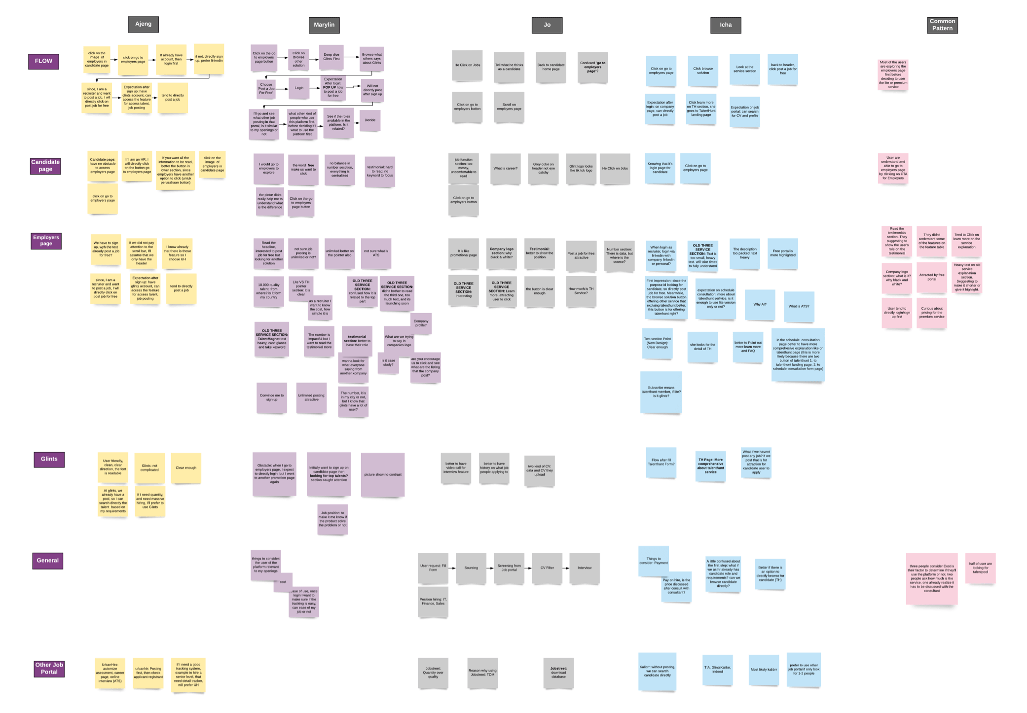
Every key actions/insights on each page is recorded and written on the diagram for us to find the common pattern or similarities for each page/flow.
Testing result
- All participants are understand and able to go to employers page by clicking on CTA for Employers.
- All participants can take any further action on the Employers page. Most of them exploring the whole employers page first before deciding to take the action. Either to use the free or premium service.
Key takeaways/Insights
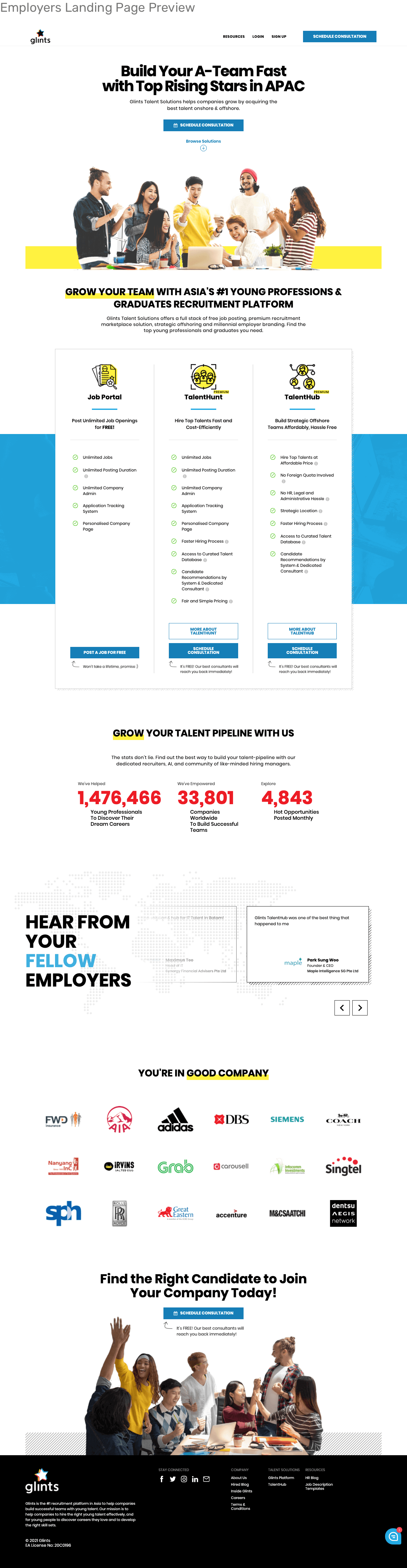
Most of the insights are found in the employers landing page instead.
- The participants didn't understand the meaning of some of the features listed on the product's feature table. Yet they’re curious and click on the learn more button.
- The participants are attracted by free service/product.
- The participants are curious about pricing for the premium services.
- Need to highlight the points of each feature in the feature table so they can read it faster.
Based on the results, the ideas proposed on the prototype are considered as passed with the addition of the insights found, that mostly on the employer's page, which is out of the scope of the main testing. All key takeaways/isights are still being noted and followed up.